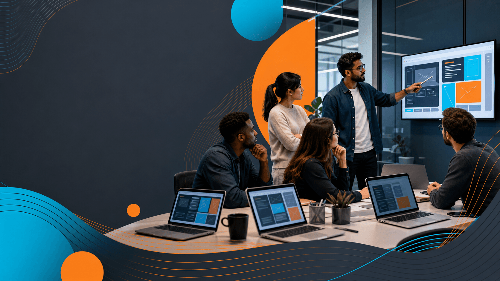
Introduction
Good website design is not just about how something looks when it loads. It is just as much about how each part of a page moves as people scroll through it. The right motion can guide someone's focus, make browsing feel smoother, and help a brand come across as thoughtful and modern.
When we work on website design in Green Bay, WI, we think about how motion plays a big role, especially during winter. When things move a little slower outside, the right movement on a webpage can help keep energy up. Whether it is a soft transition or a button that changes slightly when someone hovers over it, these details matter. They help our sites feel alive, not frozen in place.
Moving with Purpose: Why Motion Matters in Web Design
Movement keeps people interested. As someone scrolls, small accents like fading images or text that slides into view can keep their attention moving too. The goal is not to overload the screen, but to give the page a rhythm that feels natural and helps guide the eye.
- Motion helps break up long pages and leads the reader through the content.
- It adds a sense of progress, which can keep people scrolling longer.
- In colder months like February, motion can add warmth and contrast to the stillness outside.
We have seen how a small animation can change a whole experience. A loading symbol that feels playful, a menu that opens with a quick slide, these things carry a tone. They make the visit feel less like reading a brochure and more like an interactive experience.
Smart Ways to Add Motion to Your Website
Adding movement should never feel random. When we build motion into a layout, we make sure it has a job to do: help people see what they need, when they need it, without making them stop and think too hard.
- Scroll-triggered effects are great for revealing new sections as someone moves down the page. It feels smooth and often adds surprise, which encourages more scrolling.
- Transitions between page sections keep movement feeling fluid. A sharp cut from one background color to another can feel jarring. A light fade eases the shift naturally.
- Hover effects, like a button that grows slightly or changes color when touched, give people feedback. It is a small way to say, "Yes, you are in the right spot."
These features are not flashy. In fact, they work best when they barely register. People do not stop to think about a gentle slide-in, but it helps keep the experience clean and continuous.
Motion can also be subtle enough that visitors hardly notice it, it simply feels right. For example, a testimonial section that slides gently into view adds life to the page without overwhelming it with animation. It is these subtle movements that help guide attention, connect different parts of the page, and create a sense of natural progression as people make their way through your content.
What Works Best for Local Businesses in Green Bay
Websites in Green Bay do not need wild effects. They need thoughtful motion that fits with the pace of our seasons. In winter, that means creating pages that feel natural, welcoming, and easy to use.
- Use gentle fades and slow shifts to match the quieter tone of February. There is no need to rush the visitor.
- Always test motion on real devices. If an animation runs too slowly or feels clunky on a phone, it can frustrate users more than it helps.
- Let the motion match the message. If we are talking about comfort items or winter prep, the tone should feel soft. If we are showing off spring readiness, we might speed things up a touch to match the sense of forward motion.
Movement does not have to be fancy to be effective. Our experience is that the quieter animations often feel more thoughtful and more human, especially when built into the structure of the page. Matching motion styles to your business can be subtle, such as using light gliding reveals for service highlights, which keeps visitors engaged without harsh distractions. During the colder months, soft and intentional movements can even make digital spaces feel warmer and more inviting, which is important when so many interactions are happening indoors.
Balance Is Key: When to Hold Back on Motion
Too much motion can backfire. A page that shakes, bounces, or shifts too often becomes distracting instead of helpful. Motion should lead, not confuse.
- Limit movement so that one or two animations draw the eye, while the rest of the page stays still.
- Think about connections with slower internet. Not every visitor has fast data, especially in more rural areas around Green Bay. If a motion slows down the whole site, it hurts more than it helps.
- Motion should group the right items visually. For example, if two parts of a service are related, having them appear in sync can quietly tell that story without needing more text.
Restraint makes good design stand out. We do not add motion just because we can. When it feels smooth and helps the eye move easily, that is when it works best.
Some visitors may be sensitive to unnecessary movement or be on devices that don't perform well with heavy animations. Keeping the number of animations low also helps highlight what matters most on your page. For instance, letting a headline gently appear as users scroll in draws attention at just the right time, while keeping the background and other elements calm for a balanced overall effect.
Engaging Every Scroll with Easy-to-Follow Design
What someone sees on their screen should never feel like too much. Good motion makes the visit feel easy to follow, and it helps visitors move with purpose. We think about when to add a shift or reveal, and just as much about when to hold still.
For local businesses in Green Bay, winter can mean fewer walk-ins but more online browsers. If we can spark interest with a scrolling experience that feels active and clean, there is a better chance of keeping visitors engaged long enough to take action.
Motion does not have to steal focus. In fact, the best motion often works quietly to keep someone moving forward. Clean lines, clear buttons, and well-timed animations add polish to a site without needing to say a single word. When done right, movement becomes part of the brand, not just part of the style.
It is important that every element of the site works together so nothing feels out of place. This is why timing and quality matter with every scroll and animation. A well-balanced use of motion feels almost invisible, it simply helps tell your story and keeps people interested and comfortable as they move through each section.
At 10com, we use modern web design techniques, including custom animations and scroll effects, to help Green Bay businesses improve user engagement and guide visitors through every stage of their site. Our digital team creates mobile-optimized layouts and balances motion with function for a seamless experience on any device.
When winter slows things down, your online presence can keep your business active and engaging. At 10com, we design every page to guide visitors smoothly no matter the season or device. Let's make your site perfect for winter with thoughtful website design in Green Bay, WI. Contact us today to get started.